

Silkcrayon Records
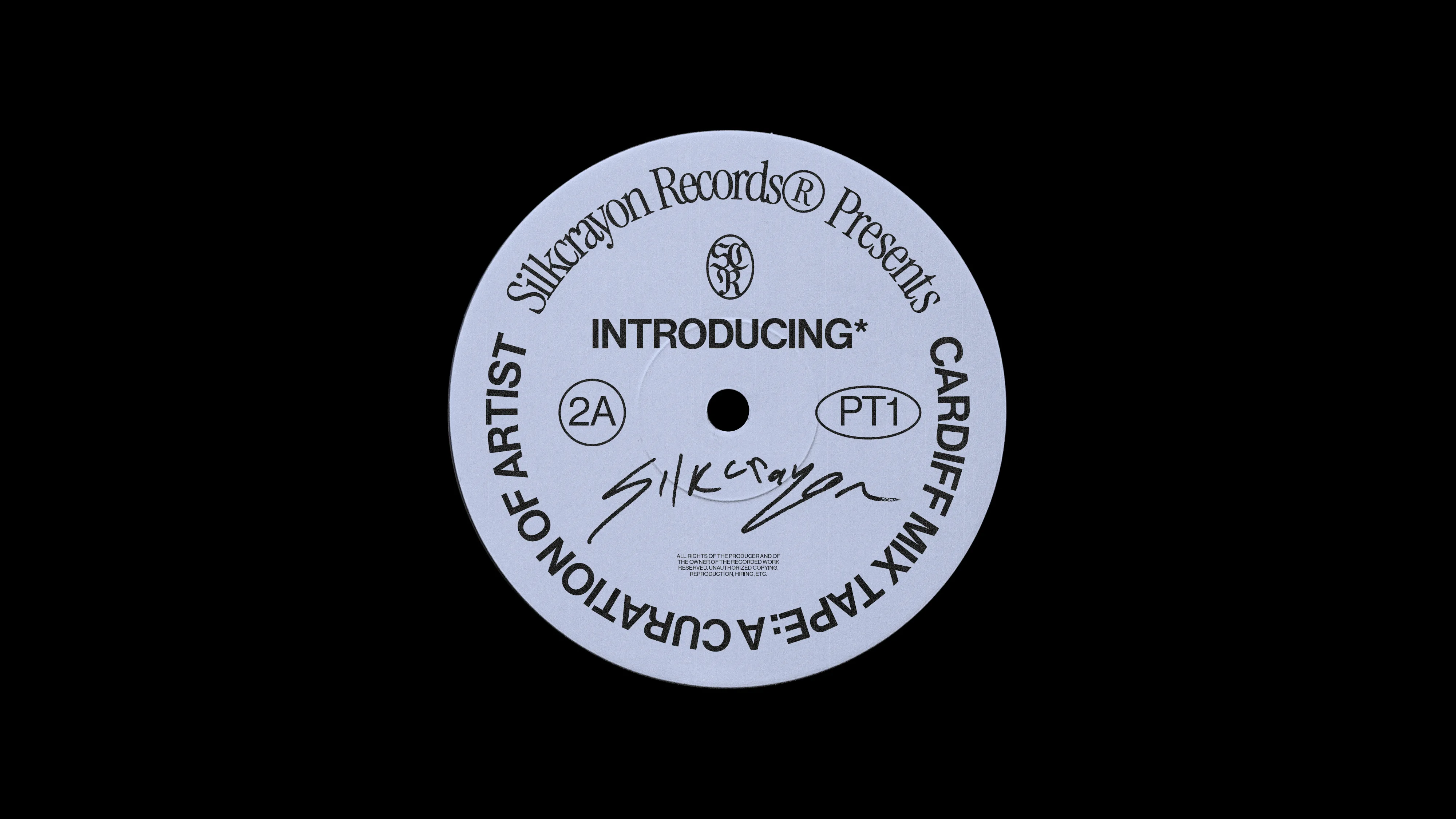
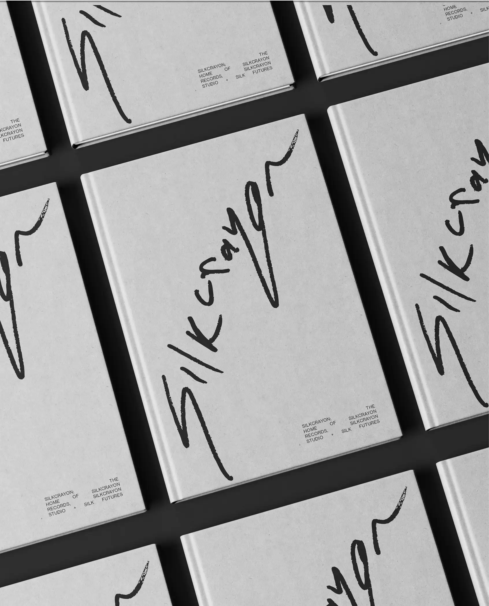
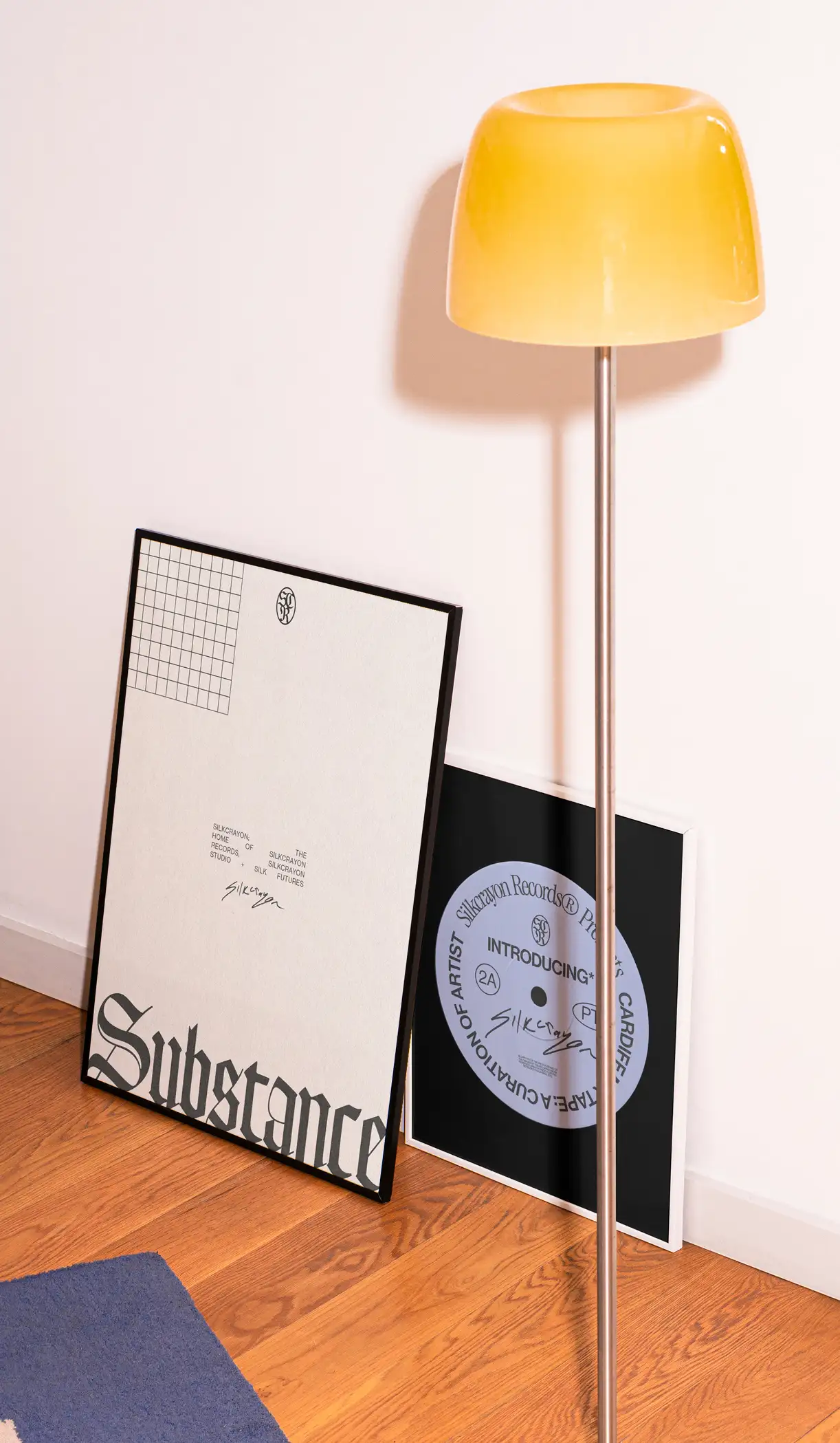
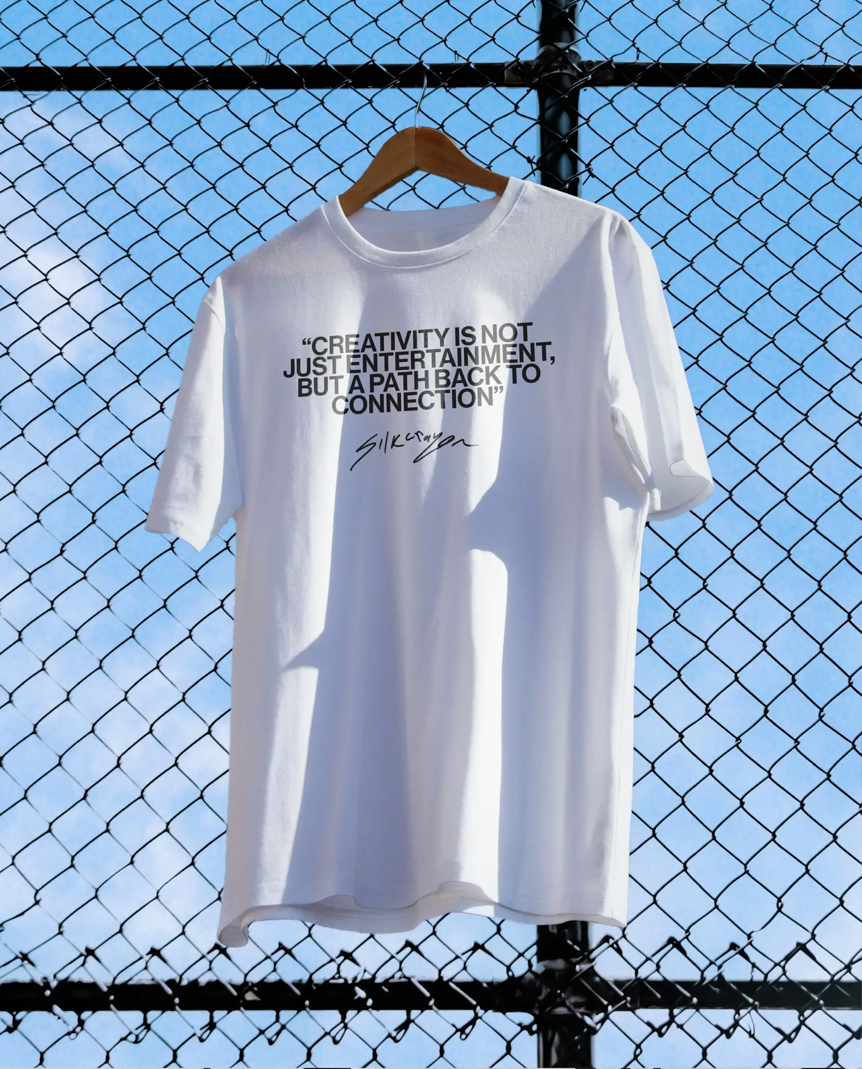
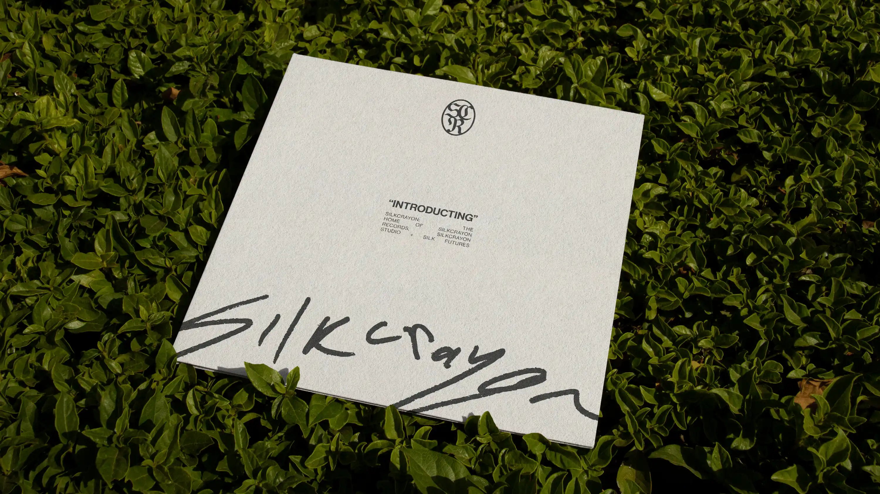
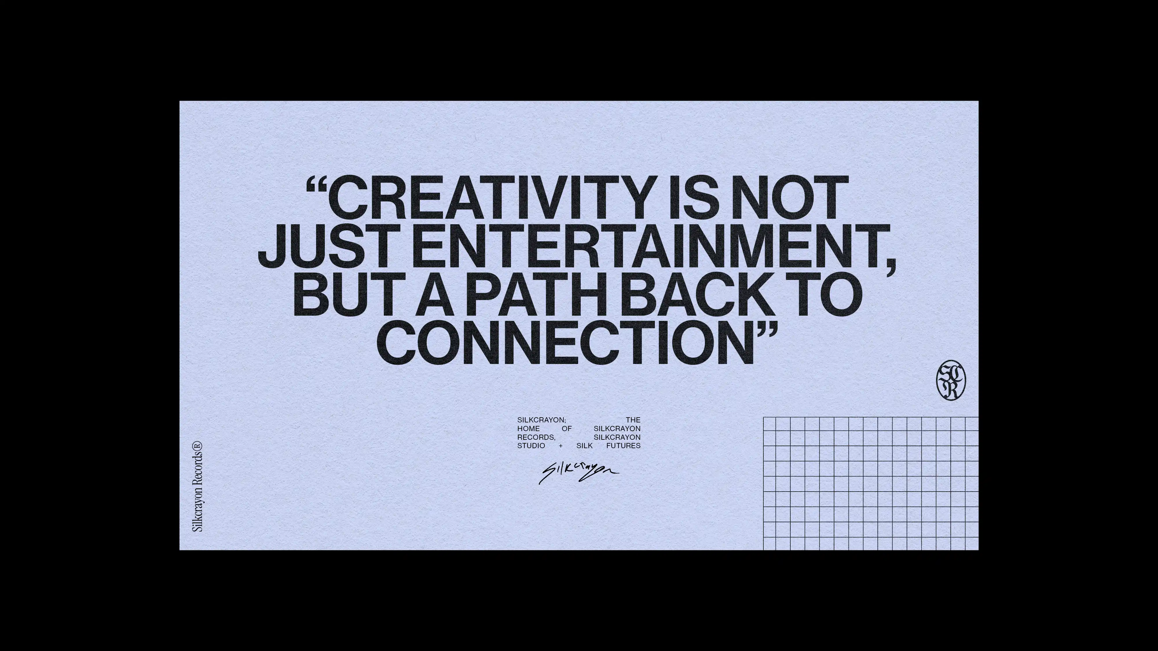
Silkcrayon Records is a conceptual identity built around contrast – balancing raw expression with refined structure. Through hand-drawn typography, scanned textures and minimal layouts, we created a visual language that feels both instinctive and controlled, combining underground music culture with a more contemporary editorial aesthetic.
The Brief
Silkcrayon Records approached us to create an identity that felt expressive, authentic and rooted in craft. The aim was to build a brand that balanced rawness with refinement – something that could feel both underground and contemporary at the same time.
The identity was built through a hands-on process using hand-drawn marks, scanned textures and handwritten lettering. Rather than creating something overly polished, we wanted the brand to feel human, instinctive and slightly imperfect.

The Concept
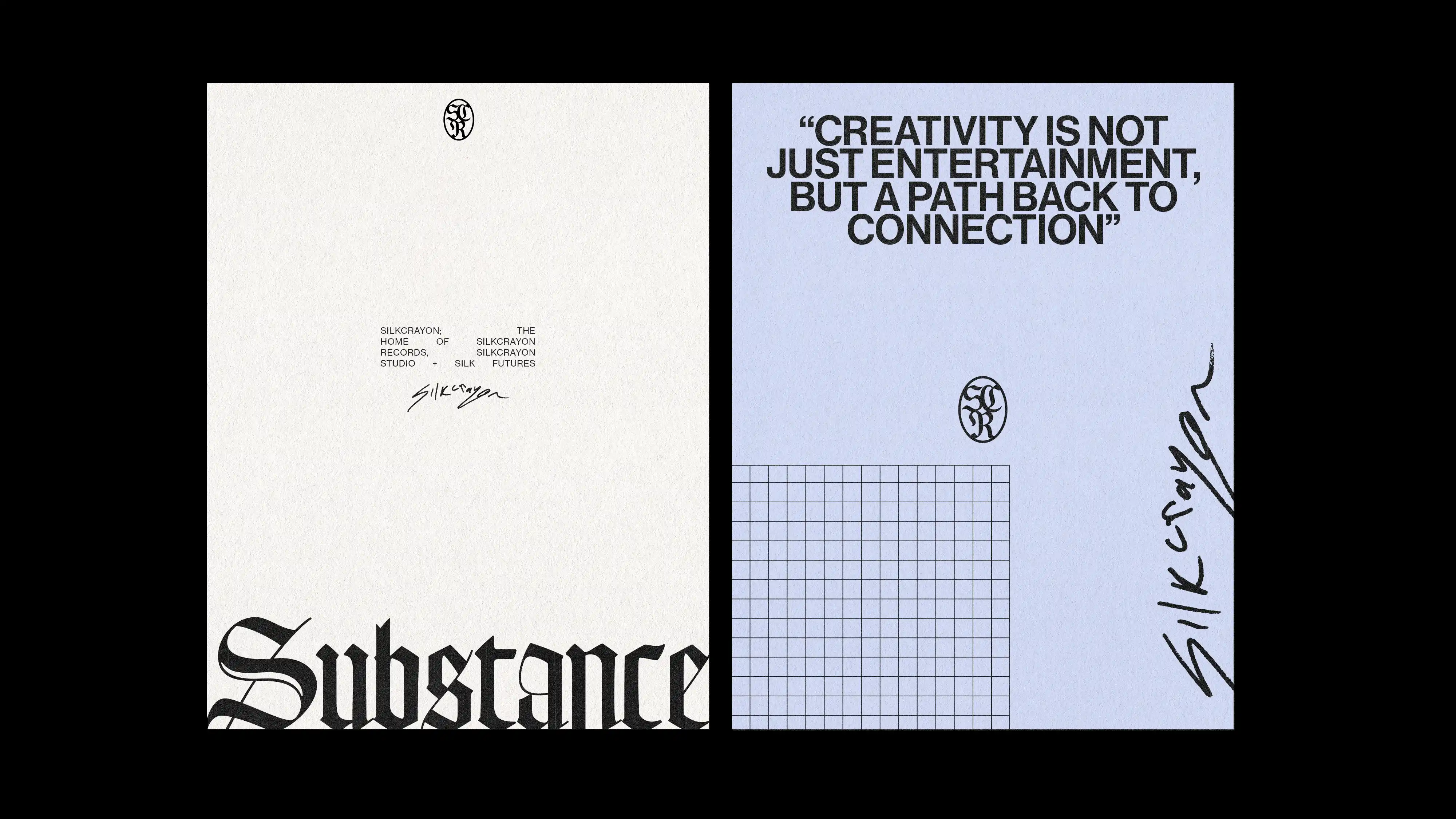
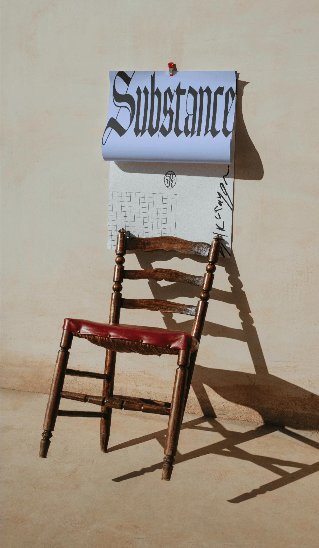
These rough, expressive elements were then paired with clean layouts, minimal typography and structured grids to create contrast throughout the identity. This balance between raw and refined became the foundation of the visual language, helping the brand feel both timeless and contemporary.
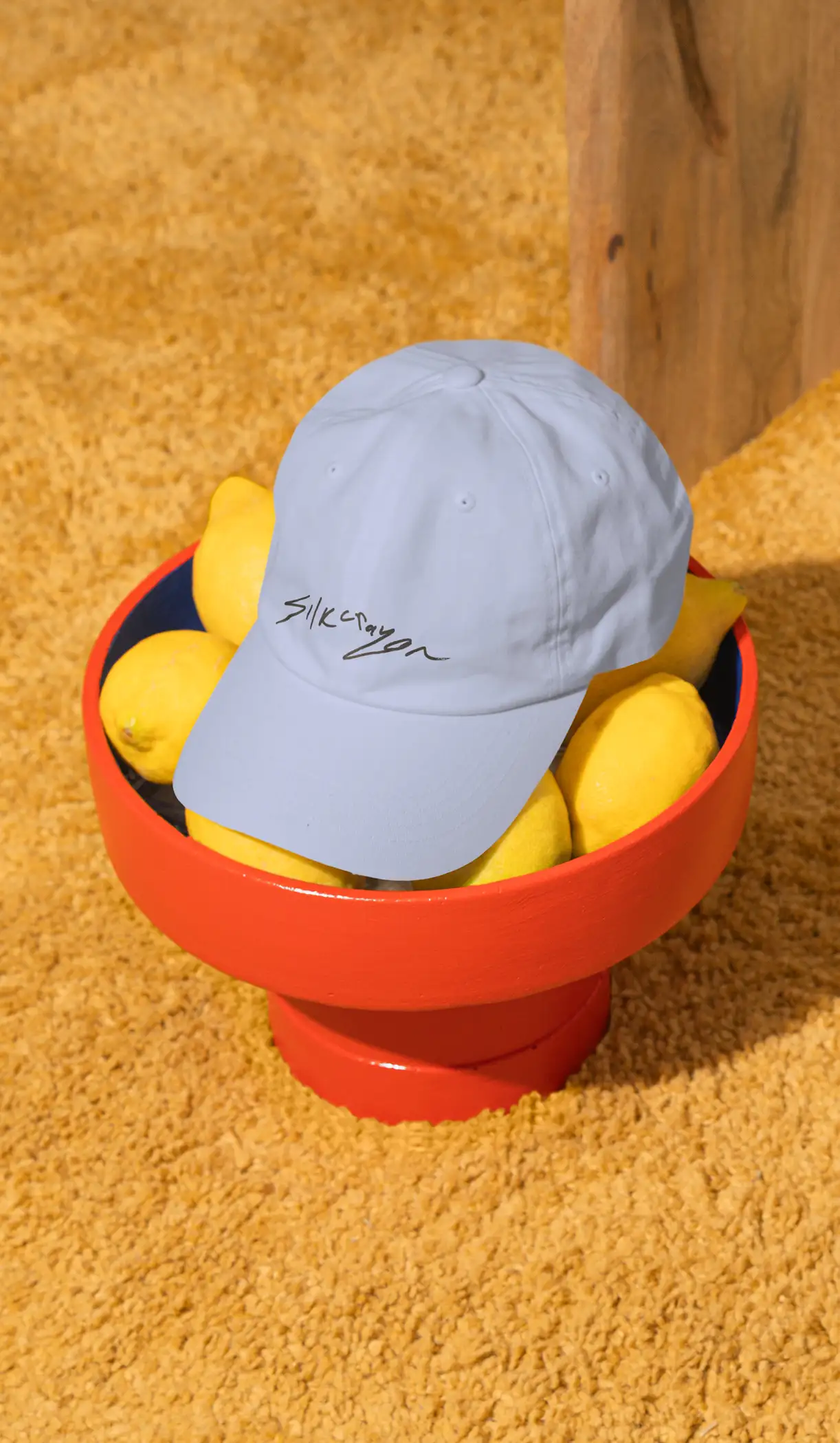
The colour palette of black, white and powder blue reinforced this further – balancing boldness and softness in a way that felt true to Silkcrayon’s tone.